A corporate website gets very different visitors. A client is comparing vendors, a candidate is deciding whether to apply, a partner is checking who they are dealing with, a journalist is looking for a press contact. Corporate website design has to get each of them to the right section in a couple of clicks, and look like the company rather than yet another template.
Here is what the work involves: which sections you need, how to structure a corporate website, how to choose a visual style and what to check in the mockups before development. This is where we start every corporate project when companies come to us for custom website development.
Why a company needs a corporate website and who visits it
A corporate website is not a showcase for a single product. It is the company's presence online. Clients and partners judge the size of the business, its experience and its attention to detail by it. Often the site is opened after the first contact: a sales rep sent a proposal, and the recipient goes to check who you are.
So the first step is to list your audiences and their questions. For a typical company the list looks like this:
- Clients. What you do, for whom, how you differ, what it costs, how to get started.
- Partners and suppliers. How reliable you are, your company details, who handles partnerships.
- Job seekers. What your team and culture are like, which positions are open.
- Press and investors. News, key facts, contacts for inquiries.
Each audience takes its own path through the site. Good structure means a short path for every audience, not one menu for every occasion.
Corporate website structure: which sections you need
Corporate websites have similar sets of sections, and that is fine: visitors expect to find contacts in the top right corner and projects under "Projects." What differs is the depth of each section and what the company puts front and center.
- Home: who you are, what you do and where each audience should go next.
- About: history, principles, team, facilities, certifications and licenses.
- Services or products: a separate page for each line of business, not one combined list.
- Projects or case studies: what exactly you did and for whom.
- Clients and partners: logos and testimonials, if they are real and approved.
- News or blog: shows the company is active and brings in search traffic.
- Careers: open positions and what it is like to work there.
- Contact: addresses, a map, department phone numbers, company details, a contact form.
If a company has several lines of business, each needs its own landing page with a description, examples and an inquiry form. A single "Services" page with a list of fifteen items does not sell and ranks poorly: the search engine has nothing to hold on to.
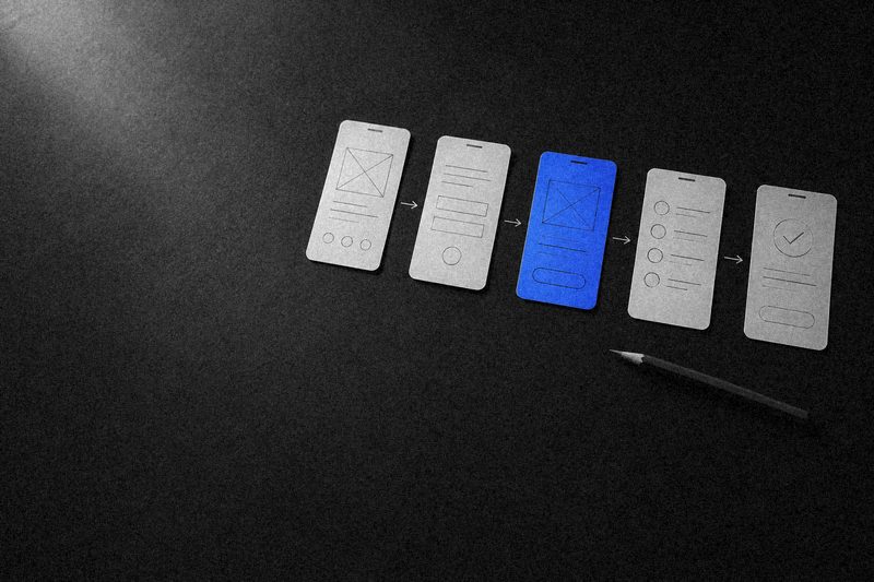
Structure is easiest to test on a prototype: it already shows how blocks are distributed across pages, but there are no visuals yet to distract from the substance.
The homepage: what it should include
A corporate homepage works like a signpost. Its job is to explain within seconds what the company does and send visitors to the right sections. It does not need to tell the whole story at once.
A typical working order of blocks:
- Hero section. What the company does, in one clear sentence, plus the main action: view services, see projects or get in touch.
- Lines of business. Service or product cards linking to their pages.
- Proof. Projects, clients, key facts about the company, certifications.
- How you work. The stages of working together, to answer "what happens next."
- News. Two or three recent posts so the site looks alive.
- Contact. A short form or direct ways to reach you.
A common problem with the hero section is an abstract slogan like "Building the future together." It says nothing. Better to state plainly what you do and for whom, and leave the imagery to the visuals.
Visual style: translating the brand into a website
A brand book covers the logo, colors and fonts. A website needs more than that: rules for how the brand behaves in an interface. The visual style of a corporate website comes down to several decisions.
Grid and rhythm
The grid defines how blocks line up on the page across screen sizes. A single grid and spacing scale keep the site coherent even when it has a hundred pages filled by different people.
Typography
Corporate sites get read a lot: service descriptions, news, job listings. The typeface has to work in long text and in small captions, and the heading hierarchy has to show at a glance what matters most. A distinctive display font belongs in headings, not in body text.
Photos and illustrations
Nothing makes a site more faceless than stock people in suits shaking hands. Real photos of the team, office and production floor are far more convincing. If there is no photo shoot, honest graphics or illustrations in the brand style are better than stock.
Color and accents
Brand colors on a website work as accents: buttons, links, highlights. Flood everything with them, and the eye has nothing to catch on, so the main action gets lost.
A corporate website's visual style is not decoration. It is a set of rules that keeps the site recognizable when people fill it without a designer.
At the visual code stage, we show several options in different styles and design from scratch, with no templates. Options built on the company's real content help choose not "what looks prettier" but what best conveys the character of the business.
Trust and leads: what persuades on a corporate website
For B2B and large deals, the corporate website is part of the sale. Visitors look for proof that you are safe to work with. Specific things help:
- case studies describing the problem and the solution, not just logos;
- facts about the company that can be verified: year founded, locations, production capacity;
- faces: leadership, heads of business lines, contacts of specific people;
- documents: licenses, certifications, company details;
- a clear next step on every service page: a form, a phone number or a messenger.
It also matters for search: Google's quality guidelines emphasize trust, and complete contact details, company information and detailed service pages help your rankings as well as your visitors' confidence.
What to check in mockups before development
Beautiful homepage mockups do not mean the site is ready for development. Before handing them off to the front-end team, go through this list.
- There are mockups for every page template (service, project, news post, job listing, contact), not just the homepage.
- Mobile versions of key screens are designed, not just desktop.
- States are covered: an empty news list, a form error, a successful submission.
- Pages are built from reusable components a content manager can combine.
- The copy in the mockups is real or close to real, not lorem ipsum.
- It is clear which fields the editor will fill in the content management panel.
End-to-end corporate website development: how the process works
An end-to-end corporate website is more than design and front-end code. The work includes market and competitor research, structure and prototype, UX/UI, copy, development on Next.js, WordPress or another stack, a content management panel, responsive layouts, analytics and post-launch support. When one team does all of it, the design is built around what the system can actually do instead of being reworked during development.
We work in four stages: research, structure and meaning; visual code and design; development and testing; launch and growth. Our projects include corporate websites, for example for a manufacturing company and for a regional telecom operator, where the site also got a customer account. As a web development agency, Sphere takes on projects like these; you can see examples in our website development projects.
The cost of a corporate website depends on the number of unique page templates, the amount of content, integrations and who prepares the copy and photos. When comparing proposals from web studios and agencies, compare the scope of work, not the bottom line.
FAQ
How many pages should a corporate website have?
As many as it takes to answer your audiences' questions. A typical corporate website has a homepage, about, services or products, projects, contact and a few utility pages. If the company has many lines of business, each gets its own landing page. The size is determined at the structure stage, not set in advance.
Can a corporate website be designed on a template?
Yes, if the company is small and the site is just a digital business card. But a template dictates a structure and visual language shared by thousands of other sites, while a corporate website is supposed to set the company apart from competitors. We design from scratch: the structure and style grow out of business goals, not a ready-made theme.
What should we prepare before design work starts?
A brand book, or at least a logo and brand colors, a list of services and business lines, project examples, photos of the team and facilities if you have them, and a list of competitor websites. It also helps to define in advance who visits the site and what each type of visitor should do. The agency will gather the rest during research.
How is a corporate website different from a landing page?
A landing page does one job: sell one product or collect leads from one ad campaign. A corporate website serves several audiences at once: clients, partners, job seekers, investors, press. That is why it has a multi-page structure, navigation and sections that grow over the years.