People open an app on the go, with one hand, on a weak connection, for half a minute. In that time they need to figure out where they are and do what they came for: order, book, pay, check a status. If that doesn't work, the app gets deleted, and there's usually no second chance.
That's why mobile app design doesn't start with colors and icons. It starts with user flows: who uses the app, in what situation, and in how many steps they get the job done. Let's walk through how we go from goals to mockups that are ready for development, and what matters in an interface built for iOS and Android.
Where app design begins
The first question is why the app matters to the business and to the user. For the business, the goal might be repeat purchases, a lighter load on the call center, or taking a process digital. For the user, the goal is always simpler: get a specific thing done quickly. If these goals aren't spelled out, arguing over mockups is pointless because there's nothing to measure them against.
Next we look at the audience: who these people are, where and when they open the app, how comfortable they are with their phones. A courier wearing gloves, a manager between meetings and a shopper on the couch in the evening need three different interfaces, even if the features are similar.
User flows and a screen map
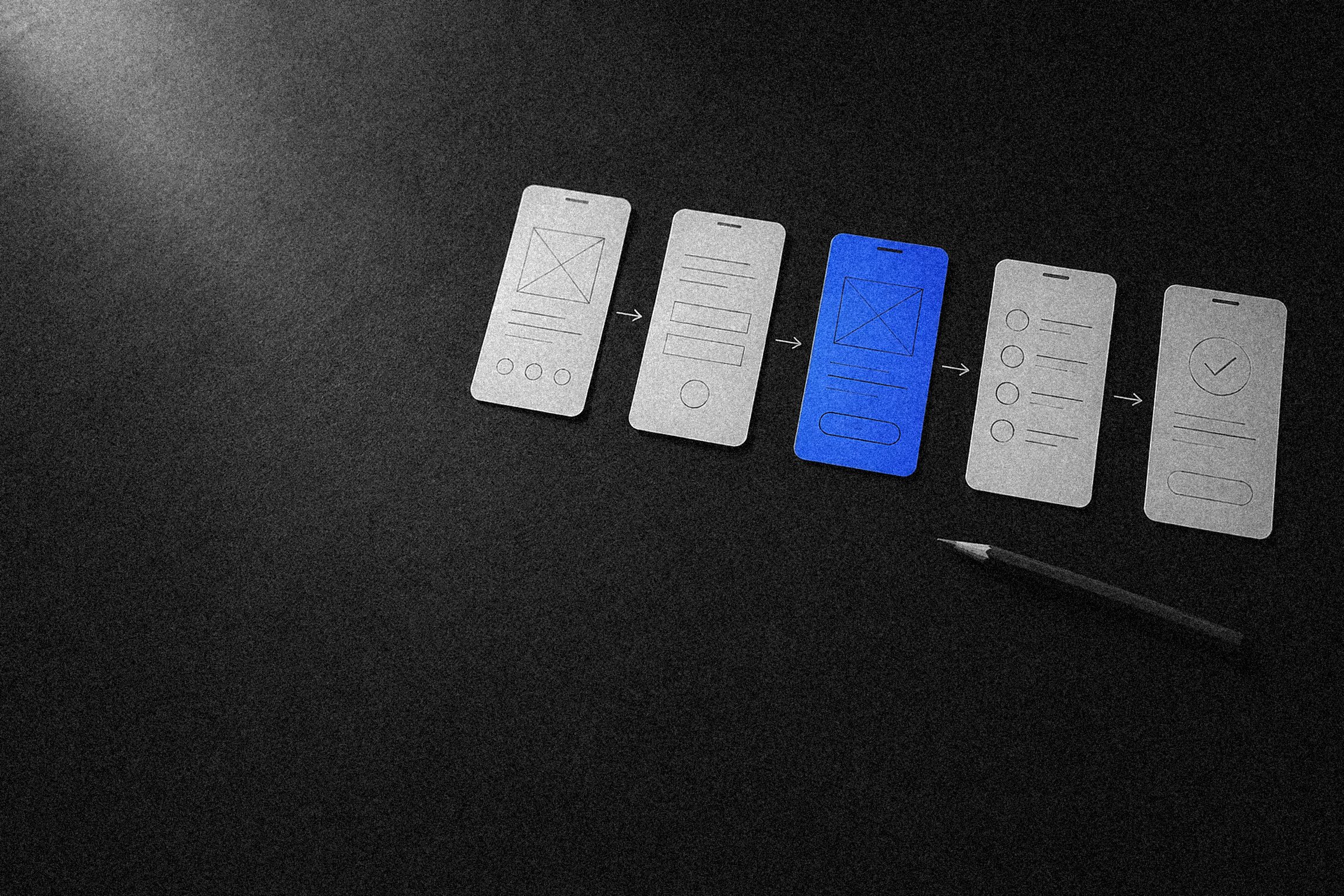
A user flow is a person's path to a goal: "opened the app from a push notification, saw the order status, contacted support." For every key flow, we describe the steps, the data needed at each step and the points where people might get lost.
The flows come together in a screen map: every screen in the app and the transitions between them. It immediately shows which screens are unnecessary, where a flow is too long and which sections need to be reachable from anywhere. A screen map is cheaper than any mockup, and mistakes in it take minutes to fix.
Navigation and the mobile app interface
Navigation answers two questions: where am I, and how do I get where I need to go? Mobile apps have several established patterns for this, and users already know them.
- Tab bar or bottom navigation. Three to five main sections at the bottom of the screen, one tap to switch. Works for most apps with several equally important sections.
- Screen stack. Drilling down: list, card, details. Going back via a button in the header or a gesture.
- Modals and bottom sheets. For short, self-contained tasks: a filter, picking an address, a confirmation. They close without derailing the main path.
- Gestures. Swipe back, swipe on a list item, pull to refresh. A gesture should never be the only way to perform an action, because not everyone will discover it.
The thumb zone and touch target sizes
Most of the time, people hold their phone in one hand, and the thumb easily reaches the bottom and middle of the screen. The top corners of large phones are the hardest zone to reach. So primary actions go toward the bottom: the tab bar, the screen's main button, the pay button. The top keeps the title, search and rarely used actions.
A touch target is the area you can tap. Apple recommends a minimum of 44×44 pt, Google 48×48 dp. An icon can be smaller, but the tappable area around it shouldn't be, and neighboring targets shouldn't run into each other.
Key actions belong where the thumb can reach, not wherever there happened to be room.
App onboarding and permission requests
Onboarding is the first few screens after install. Its job is to get the person to their first useful result, not to tour every feature. Three illustrated slides that everyone swipes past rarely accomplish much. Contextual hints work better: shown at the moment someone first encounters a feature.
Sign-up is also worth postponing wherever possible. If the catalog, schedule or prices can be viewed without logging in, let people see the value first and leave their phone number or email afterward.
How to ask for permissions
Notifications, location, camera, contacts: each permission is requested by the system, and on iOS the system prompt can't be shown again. Once denied, access can only be turned on in Settings. On Android 13 and later, notifications require permission too. So the request should come at the moment it makes sense: camera access when the user taps "Scan," location when they choose a delivery address.
Human Interface Guidelines and Material Design
Apple and Google each have their own interface guidelines: Human Interface Guidelines for iOS and Material Design for Android. They aren't a mandatory style; they describe how system elements behave and what users on each platform expect. An app can have its own brand and visual language, but it's best not to break the basic behavior.
| iOS (HIG) | Android (Material) | |
|---|---|---|
| Minimum touch target | 44×44 pt | 48×48 dp |
| Primary navigation | Tab bar at the bottom | Bottom navigation or navigation drawer |
| Back | Header button and swipe from the left edge | System gesture or Back button |
| System font | San Francisco, Dynamic Type | Roboto, font scaling in sp |
| Primary action | Button in the header or at the bottom | Often a floating action button (FAB) |
| Picking from a list or a date | Wheel pickers, bottom sheets | Dialogs and dropdown menus |
There's more in common than different: both guidelines call for large touch targets, readable text, clear hierarchy and support for system settings. iOS and Android app design is usually built on a single design system, with the differences handled in navigation, system components and gestures. That way the app stays recognizable without feeling foreign on either platform.
Screen states: empty, loading, error, offline
In mockups, a screen is usually drawn in its ideal form: data loaded, list populated, connection solid. Real life is different, and this is exactly where apps most often look broken. For every screen we design these states:
- Empty. No orders, favorites or messages yet. The screen explains what will appear here and suggests a first action.
- Loading. Skeleton placeholders where content will appear instead of an endless spinner. For long operations, a progress indicator.
- Error. Plain-language text about what happened and what to do, plus a Retry button. No error codes.
- Offline. What previously loaded content can be viewed without a connection, and which actions will queue up and be sent later.
States aren't a minor detail for developers to sort out. If they aren't designed, they'll be improvised on the fly, and every section will end up handling them differently.
Accessibility: text size, contrast, dark mode
Many users increase their phone's system font size. The interface has to cope: text wraps, buttons grow, nothing gets cut off. It's easy to check: turn on large text in your phone's settings and go through the main flows.
WCAG contrast between text and background should be at least 4.5:1 for regular text and 3:1 for large text. Gray text on a light gray background looks great in a presentation and is hard to read outdoors. Information shouldn't be conveyed by color alone: an error in a field is flagged with text too.
Users turn on dark mode at the system level and expect apps to support it. It isn't a color inversion: it needs its own background shades, muted accents, and checks for contrast and illustrations. If colors are defined as tokens in the design system from the start, dark mode becomes a second set of values rather than a redraw of every screen.
App prototypes and user testing
A prototype is a clickable model of the app you can walk through before development begins. We start by building it from simple gray blocks so the conversation stays on logic, not colors. Then, once the structure is agreed on, the visual design becomes clickable too.
Testing doesn't require a lab. Five or six people from the target audience, a phone with the prototype and a list of tasks are enough: "find the nearest pickup point," "move your appointment to tomorrow." We watch where people hesitate, where they tap the wrong thing, what they miss. Each of those moments is a fix that costs hours in a prototype and weeks in finished code.
The design system and developer handoff
Developers don't receive a set of images; they receive a system of components, rules and tokens. How complete it is determines whether the app ends up matching the mockups.
- Components. Buttons, fields, cards, lists, bottom sheets, with every state: default, pressed, disabled, error, loading.
- Spacing and grid. A spacing step such as 4 or 8, screen margins, rules for different phone sizes and safe areas around the notch and gesture bar.
- Typography and color. Text styles and color tokens for light and dark themes.
- Animation. Screen transitions, sheets sliding in, tap feedback: duration, easing curve, what's linked to what. Better shown in a prototype or video than described in words.
- Icons and illustrations. In vector format, at the right sizes, with clear names.
The designer stays involved during development: answering questions, reviewing builds and signing off on screens. App design ends with reviewing the build, not with the mockups.
Store assets: the icon and screenshots
The App Store and Google Play listing is part of the design too: it's where people decide whether to install. The icon has to read at a small size and on any wallpaper: one simple image, no small text. The App Store takes a 1024×1024 pixel icon, Google Play a 512×512 one.
Screenshots aren't just screen captures; they're a short story, with one benefit and a large caption on each. The first two or three frames are visible right away in search results, so that's where the most important points go. Google Play also requires a 1024×500 feature graphic. The stores change their screenshot size and count requirements from time to time, so check them against the current documentation before publishing.
Other common mistakes:
- porting a website into an app one to one, hamburger menu and long pages included;
- one design for both platforms with no regard for gestures and system navigation;
- asking for every permission on the first screen;
- a five-slide onboarding before any useful action;
- error and offline states that were never thought through.
Mobile app design stages and checklist
- Goals and audience. We define business and user goals, review competitors and the situations in which people open the app.
- User flows and screen map. We describe the key paths and build the app's structure.
- Prototype. We build a clickable model and test it with users.
- Visual style. We propose several options on key screens and choose a direction.
- Mockups and design system. We design every screen and state for iOS and Android and assemble the components and tokens.
- Handoff and design oversight. We prepare store assets, support development and review builds.
Before handing off to development, run through a short checklist:
- key flows take the fewest possible steps and have been tested with real people;
- primary actions sit in the thumb zone, and touch targets are at least 44 pt and 48 dp;
- navigation and the back gesture work the way users expect on each platform;
- permissions are requested in context, with an explanation;
- every screen has empty, loading, error and offline states designed;
- the interface holds up with large system text, and contrast meets WCAG;
- there's a dark mode, or a deliberate decision not to have one;
- components, spacing, colors and animations are documented in the design system;
- the icon, screenshots and graphics for the App Store and Google Play are ready.
As an app development company, we build apps end to end: from audience research and user flows to design, development and publishing in the stores. You can see examples on our work page.
FAQ
Do you need separate designs for iOS and Android?
Usually not. Teams create one design system and a shared visual style, and handle the differences in navigation, system components, gestures and dialogs. That saves time, and the app still behaves the way users expect on each platform.
Can you start design without a technical spec?
Yes, as long as the goals and audience are clear. User flows, the screen map and the prototype become the foundation for the spec themselves, and they make it easier to estimate development than a written description does.
How many screens need to be designed?
It depends on the user flows. Count not only the main screens but also their states, modals and onboarding: a single screen on the map often turns into several mockups.
How is an app prototype different from the design?
A prototype tests the logic: which screens exist, what's on them and how you move between them. Design covers the look, the components and the details. The prototype is agreed on first and the design comes after; otherwise the logic has to be reworked in finished mockups.