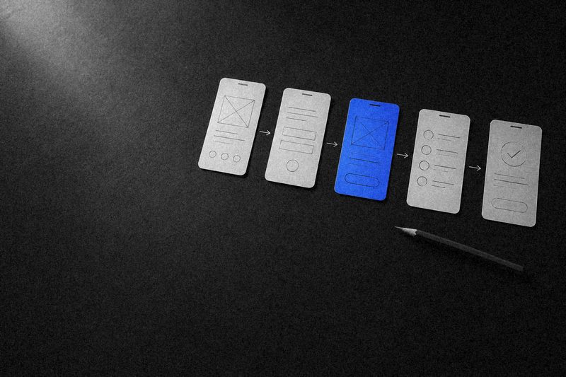
Traffic is coming in, the ads are paid for, but leads are scarce. The first instinct is to change the design or raise bids. But most of the time the money isn't lost in advertising, it's lost on the site itself: someone couldn't find the price, got tangled in filters, abandoned the form at the "Tax ID" field, or didn't see how you differ from the competitor in the next tab.
A website usability audit answers the question of where exactly people leave and why. Below we cover which sources to gather data from, what to check on a checklist, how to decide which fixes come first, and how to tell whether targeted improvements will do or it's time to think about a redesign.
What a usability audit is and how it differs from "taking a look at the site"
A UX audit checks how easily a target visitor gets their job done on the site: finds the right product or service, understands the terms, trusts the company and submits a request. The output isn't an opinion like "this looks off," but a list of problems tied to pages, scenarios and data.
The key difference from a quick look-through is the point of view. Owners and staff know the product and the site by heart, so they don't see what trips up a newcomer. An audit looks through the eyes of someone arriving from search or an ad for the first time, with competitors open in other tabs.
A conversion audit is useful in three situations: leads have dropped for no obvious reason, ads are getting more expensive and you want more out of current traffic, or the company is planning a redesign and needs to know what to keep and what to change.
An audit sees the site through the eyes of a first-time visitor with competitors open in the next tabs.
Data sources: where to look for what's broken
No single source gives the full picture. Numbers show where people leave but don't explain why. Watching people explains why, but on a small sample. That's why a usability review draws on several sources at once.
Google Analytics: reports and goals
Start with reports on landing pages, engagement and pages per session, broken down by traffic source and device. Compare desktop and mobile behavior: if mobile traffic converts noticeably worse with a similar audience, the problem is almost certainly the mobile version. If conversion goals aren't set up, set them up first, or the audit will rest on guesswork.
Funnels
A funnel built from goals shows which step of a scenario loses the most people: catalog, product page, cart, checkout, thank-you page. The step with the sharpest drop is where to focus the other methods. Funnels for individual landing pages are useful for ads: you can see which page brings people to the form and which one burns the budget.
Session recordings
Tools like Microsoft Clarity or Hotjar record sessions: cursor movement, scrolling, clicks, form input. Watching every recording in a row is pointless. Filter sessions by page and segment, for example mobile visits from ads that reached the form but didn't submit it. Twenty or thirty such recordings are usually enough to spot a repeating pattern: someone hunts for a button, erases their phone number twice because of the input mask, scrolls back up looking for the price.
Click maps, scroll maps and form analytics
A click map shows where people click, including on non-clickable elements, which is a sure sign that the element looks like a button or link. A scroll map shows how far most people get: if the key offer sits below the point where most visitors drop off, nobody sees it. Form analytics show which field people abandon the form at.
User testing
Five to seven people from the target audience get a concrete task ("find a service within this budget and submit a request") and complete it while thinking aloud. It's the most vivid way to understand why people leave. For B2B sites, real customers or sales reps who know buyers' typical questions work well as testers.
Heuristic evaluation
An expert walks through the scenarios against a set of principles: is it clear where I am and what I can do next; is the system's state visible; does the site speak the customer's language; can I recover from an error; do I have to remember information between screens. Heuristics find obvious problems quickly, but their conclusions should be confirmed with data.
Checklist: what to check in a usability audit
It's better to check whole scenarios than individual pages: the path from entry via a specific source to a submitted request. Below is a basic list that fits most corporate websites and online stores.
First screen and navigation
- Within a few seconds it's clear what the company is, what it offers and for whom.
- The landing page answers the query the visitor came with instead of sending them to a generic homepage.
- Menu items use the customer's words, not internal company jargon.
- Site search finds a product by SKU, by synonyms and despite typos.
- From any page it's clear how to get in touch and where to submit a request.
Content and trust
- Price, terms, timelines and delivery are visible where the question arises, not hidden in a separate section.
- There are case studies, company details, an address, real photos and guarantees: the things that remove doubt before reaching out.
- Copy addresses the customer's objections instead of repeating generic claims about quality and experience.
Forms and conversion elements
- The form has only the necessary fields, and the phone mask doesn't get in the way.
- Errors appear next to the field in plain language, and entered data isn't wiped.
- After submitting, the visitor sees what happens next and when they'll be contacted.
- Buttons look like buttons, and non-clickable elements don't.
Mobile version and technical basics
- Buttons are easy to tap, text is readable without zooming, nothing spills off the screen.
- Pop-ups and banners don't cover content and close on the first try.
- Pages load quickly on mobile data.
- Forms, calculators and filters work in all major browsers.
How to present audit results
A good report can be read in half an hour and turned straight into tasks. For every problem found, record:
- Where. Page, block, scenario, device type.
- What happens. A description of the behavior with evidence: a screenshot, a link to a session recording, a funnel number, a quote from a test.
- Why it gets in the way. Which user question or task is left unresolved.
- What we suggest. A specific solution, with a sketch or prototype if needed.
A report made of a hundred screenshots marked "awkward" is useless: it can't be estimated or planned. An audit's value lies in verifiable problems with clear solutions, not in the number of remarks.
How to prioritize fixes
An audit typically produces a few dozen findings, and you don't need to tackle them all at once. It helps to rate each problem on two axes: how much it affects leads and how much it costs to fix.
- Quick wins. High impact, low cost: remove an extra form field, fix the phone mask, move the price up on the product page, make a button more prominent. These go first, often in a single sprint.
- Big projects. High impact, high cost: rebuild catalog filters, rework landing pages for ad campaigns, redesign the checkout flow. These are planned separately, with a prototype and a test before development.
- Minor fixes. Low impact, low cost: typos, alignment, secondary states. These are bundled and done along the way.
- Backlog. Low impact, high cost. These wait until there's data showing they matter more than they seem.
Impact is judged by where the problem sits in the funnel: a bug in the checkout step that every buyer passes through matters more than an inconvenience on the About page. After each wave of fixes, compare the same reports and funnels you used in the audit to see what worked.
What's next: targeted fixes or a redesign
An audit is good at showing the scale of work needed. Targeted fixes are enough when the problems are local: specific forms, blocks or elements, while the site structure and scenarios work overall. That happens more often than you'd think, and it's the cheapest way to get more leads from the same traffic.
A redesign is needed when the problems live in the site's structure and logic. The signs: the catalog doesn't reflect how customers actually choose the product; key scenarios require clicking through five pages; the mobile version is just a squeezed desktop; the CMS won't allow necessary changes without rewriting templates. Patching a site like that item by item usually costs more than redesigning it.
At Sphere, reviewing the current site is part of the first phase of our work, the discovery stage before a redesign. We look at analytics data, scenarios and weak spots so the new structure fixes the problems we found and keeps what already brings in leads. Sphere is a digital agency that handles website development end to end, from research to launch, so audit findings turn directly into a prototype, design and code. You'll find examples of this work among our web development projects.
FAQ
How long does a website usability audit take?
It depends on the number of scenarios and the amount of data. Reviewing one funnel on a site with analytics already set up takes far less time than auditing a large catalog with a customer portal and user tests. A realistic timeline becomes clear once the key scenarios are defined and you've checked what data is already being collected.
Can you run an audit on a site with little traffic?
Yes, but the emphasis shifts. With few visits, click maps and funnels produce noise, so most of the weight falls on heuristic evaluation and tests with five to seven users. Quantitative data is then used to validate hypotheses after the fixes rather than to find them.
How is a UX audit different from an SEO audit?
An SEO audit answers why the site isn't getting search traffic: indexing, structure, meta tags, speed. A UX audit answers why the people who do arrive don't submit a request. They overlap on load speed, structure and the mobile version, but they solve different problems.
Do you need an audit before a redesign?
Yes. Without reviewing the current site, a redesign becomes a change of visuals: old scenario problems move into the new design, and what used to work gets lost. The review shows which pages and elements bring in leads and what needs to be preserved during the update.