A customer portal isn't where a client gets to know your company. It's where they work with it: paying invoices, submitting requests, checking history and statuses, uploading documents. Users here aren't browsing; they're trying to get something done. If the portal is awkward, the task turns into a phone call or an email, and the load falls on support and account managers.
Here is how customer portal and web app interface design works: where to start, how to build navigation, how to design forms, tables and states, what's different about SaaS design, and what to check in the mockups before development. It's based on how we, an agency that builds websites, apps and web services, run these projects.
How a customer portal differs from a website
A website sells and explains, and people read it once or twice. A portal gets used regularly, sometimes every day. That shifts the design priorities.
- Tasks over presentation. The user came to pay, check a status or send a document, and the faster they can do it, the better the portal.
- Lots of data. Lists, tables, transaction history, filters. The interface has to stay readable with hundreds of records.
- Lots of states. A request has statuses, a form has errors, a section has an empty state for new users.
- Roles and permissions. The same portal is used by the client, their employee and an administrator, and each needs a different set of features.
That's why customer portal UX is judged not by first impressions but by how many steps it takes to finish a task and how often the user needs help along the way.
Where customer portal design starts: roles and user flows
Drawing screens before you know who uses them and why is the most expensive way to build a portal. The work starts with analysis.
- Roles. We list everyone who will work in the portal: an individual customer, a company representative, their accountant, an internal administrator. For each role, what data they see and what they can change.
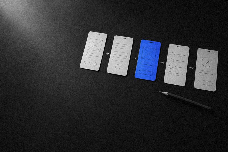
- User flows. For each role, we write down tasks by frequency: what they do daily, monthly, once a year. Frequent tasks should be one or two clicks away.
- Data and processes. Where the data comes from, what statuses objects can have, what happens after a user action, which integrations are involved: the ERP, the CRM, the payment provider.
- Prototypes. Key flows are assembled into a clickable prototype and tested with real users, or at least with the staff who deal with them.
Support tickets and questions to account managers are a great source of user flows. Anything customers regularly ask about over the phone is a candidate for a portal feature.
Navigation and the portal home screen
Portal navigation usually lives in a sidebar on desktop and in a bottom bar or hamburger menu on mobile. The main menu should be short: five to seven sections, with everything else nested inside them or in the profile.
The portal home screen isn't a welcome message or a promo banner. It's a summary of what needs attention right now: an unpaid invoice, a request awaiting a reply, a document to sign, the next upcoming event. It's also the place for quick actions covering the most frequent tasks.
A portal home screen answers one question: what do I need to do right now?
If there are several roles, each gets its own home screen. The client's accountant needs invoices and statements, a manager needs a contract overview, an administrator needs the ticket queue.
Forms, tables and statuses: what a web app interface is made of
Web app interface design mostly comes down to three types of elements. How well they're thought through determines the usability of the whole product.
Forms
Long forms are split into steps or logical groups. Fields the system can fill in itself are filled automatically: from a company registration number, from the profile, from a previous request. Errors appear next to the field and explain how to fix them, not just "Invalid value." Entered data shouldn't disappear if the user leaves the page or the submission fails.
Tables and lists
Tables are the main tool for working with data. They need search, filters, sorting, clear columns and settings that persist between sessions. On a phone, a table becomes a list of cards with the key fields instead of shrinking into something unreadable.
Statuses and notifications
Users should always know what's happening with their request, payment or document. Name statuses in the user's words, distinguish them by color and icon, and back up changes with a notification in the portal, by email or in a messenger.
The states nobody remembers to design
Every mockup has the main screens filled with data. The trouble starts in moments the designer didn't think about and the developer improvised.
- Empty state: a new user has no requests, documents or history yet. The screen explains what will appear here and suggests a first action.
- Loading: skeletons or a progress indicator so the interface doesn't jump when data arrives.
- Load error or lost connection: what happened and what the user can do.
- No permission: the user sees the feature exists but belongs to another role, and knows whom to ask.
- Long values: a company name that wraps to three lines, an amount with many digits, a hundred items in one order.
- Confirmation for irreversible actions and a success message.
Each of these states is a real screen users will see. Designed states eliminate half of support questions and save development time: the developer doesn't have to invent the behavior on the fly.
SaaS and complex web app design: what's added
If the portal is the product people pay for, as in SaaS, it comes with requirements of its own on top of everything above.
- Onboarding. A new user should get value quickly: step-by-step hints, demo data, a clear first flow.
- Plans and limits. Users can see what their plan includes, how much of their limits is left and how to switch plans, without calling sales.
- Teamwork. Inviting colleagues, roles, permissions, and a change history showing who changed what.
- Customization. Saved filters, custom table columns, notification settings.
- Interface density. Power users spend hours in the product; they need more data on screen and keyboard shortcuts, not big airy cards.
These products evolve constantly, with new screens every month. Without a shared component library, the interface quickly sprawls: every section ends up with its own table and its own filters.
How we design customer portals and web apps
We run these projects through our own stages: analysis and process mapping, then structure and prototypes of every screen, visual language and design, development and integrations, testing, launch and growth. Design and development are done by one team, so the mockups account from the start for where the data comes from and how it will be updated.
Our projects include a customer portal for a regional telecom operator built alongside its corporate website, and a CRM for internal collaboration among staff. They're different products, but the approach is the same: understand how the user works first, then design. If you're deciding who to trust with building a web app or customer portal, take a look at how Sphere works as a digital agency.
FAQ
How is customer portal design different from website design?
A website is mostly read and browsed, while a portal is where people work: they fill in forms, look up records, pay, and track statuses. So in a portal, speed of getting tasks done, data density, states and error handling matter more than a striking presentation. The visual style should still feel like a recognizable extension of the brand.
Where should customer portal design start?
With roles and user flows. You need to know who uses the portal, which tasks they do most often, and what data those tasks require. Then come the navigation and prototypes of the key screens, and visual design starts only after the flows have been tested.
Does a customer portal need a design system?
Usually, yes. A portal or web app is made up of dozens of screens with the same forms, tables and filters, and the product keeps evolving. A component library with states, tied to the code, saves time on every new screen and keeps the interface from sprawling.
Can we improve the UX of an existing portal without rebuilding it?
Yes. Start with analytics and support tickets: where users get stuck and which questions come up most. Then rework the most problematic flows one at a time while building up shared components. A full redesign in a single release is rarely needed and carries more risk.