A year after launch, a product typically has five shades of blue, four kinds of "Submit" button and three different dropdown behaviors. Nobody decided it should be that way: each new screen was designed a little differently, and developers built each one from scratch. A design system exists to keep that from happening.
Let's look at what a design system is, how it differs from a UI kit and brand guidelines, what it's made of, how it connects to code, and when building one pays off and when it's still too early.
What a design system is, in plain terms
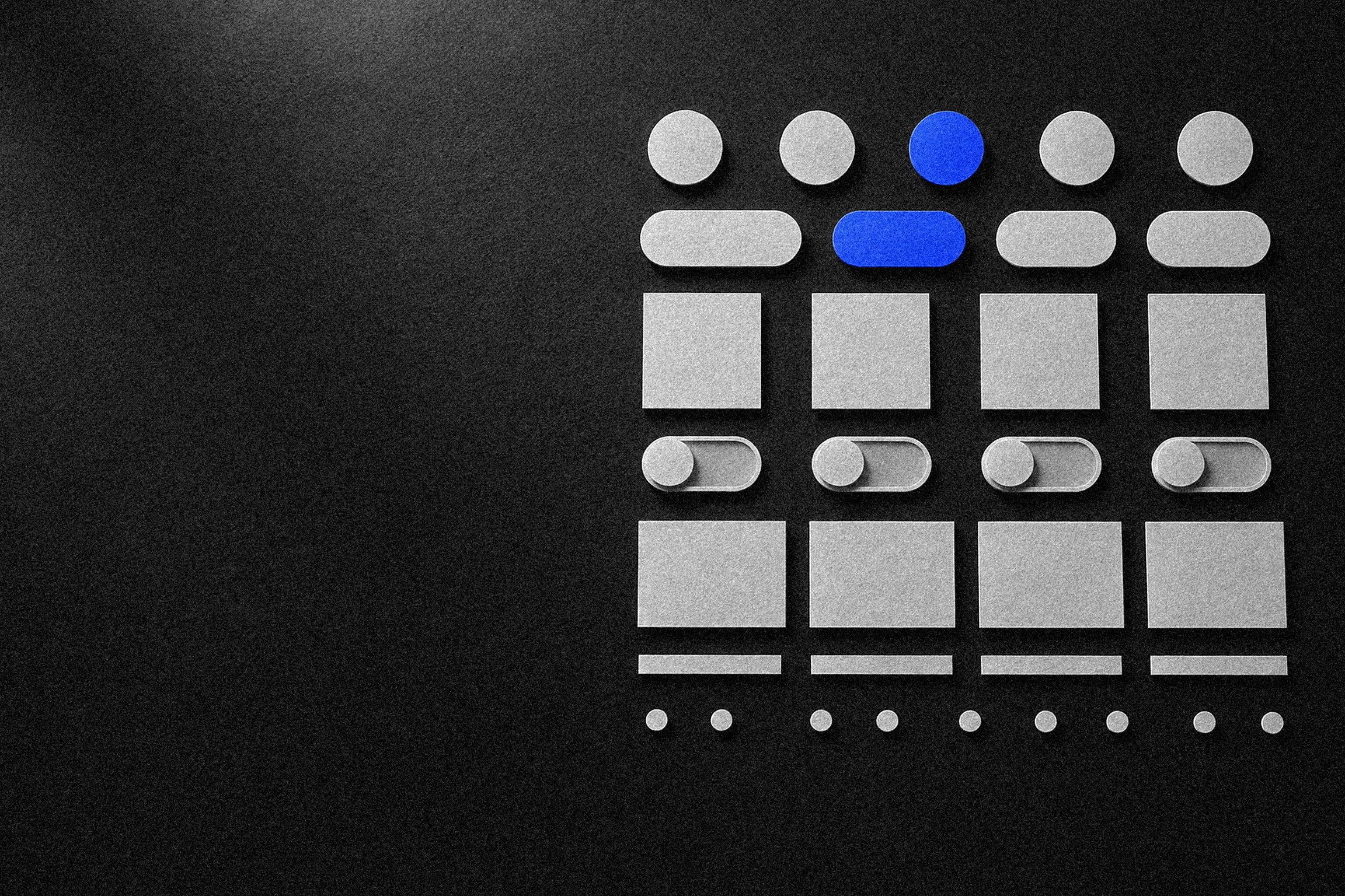
A design system is a set of reusable interface elements and the rules for assembling screens from them. It lives in two places at once: in the designers' component library, most often a design system in Figma, and in the developers' component library. Both versions describe the same things: one button, one input field, one spacing scale.
The key word in the definition is "system." A handful of nice-looking elements isn't a system yet. A system appears when every decision is made once and used everywhere: the designer picks an existing component instead of drawing a new one, and the developer plugs in existing code instead of building it again.
How a design system differs from a UI kit and guidelines
These three terms often get mixed up, and as a result the client ends up with something other than what they expected. It's easiest to compare them side by side.
| Guidelines | UI kit | Design system | |
|---|---|---|---|
| What it is | A document with brand rules | A set of elements in mockups | Tokens, components, rules and code |
| Where it lives | A PDF or web page | A Figma file | Figma and the code repository |
| Answers the question | What are our colors and fonts | What an element looks like | Which element to use and how it works |
| Who needs it | Marketing and vendors | Designers | Designers, developers, product |
Guidelines (a brand book) describe the logo, brand colors, fonts and tone of voice. That's useful, but guidelines don't know how a field with an error behaves or what to show while a table is loading.
A UI kit is a library of elements in mockups: buttons, fields, checkboxes, cards, modals. A good UI kit already includes element states. But if those elements are rebuilt from scratch in code each time, the mockups and the product will drift apart within a few months.
A design system includes the UI kit and adds three things: tokens, usage rules and a link to code. That's why a UI kit can be delivered in one project, while a design system has to be maintained for as long as the product lives.
When you need a design system, and when it's too early
A design system is an investment. Building one takes designer and developer time that doesn't turn into new screens right away. It pays off where the same elements repeat many times and the product keeps changing.
Signs it's time:
- you have a web service, customer portal or CRM where dozens of screens are built from forms, tables and filters;
- there are several products under one brand: a website, an app, a partner portal;
- several designers or development teams work on the product;
- new features ship regularly, and each one needs new screens;
- the interface has accumulated different versions of the same elements, and users notice.
And here's when it's too early: a landing page for an ad campaign, a corporate site of a dozen pages, an MVP whose concept might change next month. In these cases, a full design system for the site would eat a budget that's better spent on the product itself.
What a design system is made of
The contents depend on the product, but a working system almost always has four layers.
Tokens
Tokens are named values for basic parameters: colors, font sizes, spacing, corner radii, shadows, animation durations. Instead of "#1F5BFF," the designer and developer use a name such as "primary action color." If the brand decides to change the shade, it's changed in one place and updates across the whole product.
Tokens are usually split into base tokens (the full palette, the full spacing scale) and semantic tokens (error color, card background, secondary text). Semantic tokens are what let you build a dark theme or a separate partner version without redrawing screens.
Components
A component-based approach means the interface is assembled from ready-made parts, like building blocks. Components can be simple (a button, a field, an icon, a badge) or composite (a form, a product card, a table with filters, a header). Composite components are built from simple ones, so a change to the button automatically reaches every form.
States
Each component is described not by a single picture but by all of its states: default, hover, focus, pressed, disabled, loading, error. For screens: empty state, loading error, no permissions. States are what mockups most often leave out, and what the developer then improvises on the fly, differently every time.
Rules
Rules answer the question "when do we use what." When a button is primary and when it's secondary. How many primary buttons a screen can have. When to show an error under the field and when as a notification. How to write button labels and error messages. Without rules, the components exist, but every designer assembles something different from them.
A UI kit answers "what does the button look like." A design system answers "which button goes here, and why."
How a design system speeds up development and cuts costs
The savings from a design system don't come from designers drawing faster. They come from the team no longer solving the same problems over and over.
- New screens are assembled, not drawn. A typical portal page is a form, a table and filters from the library. The designer spends time on the logic of the flow, not on drawing fields.
- Developers don't rebuild things. If a component already exists in code with all its states, a new screen is assembly plus business logic.
- Fewer UI bugs. A component is tested once and works the same on every screen. Nobody has to hunt for where the old version of the dropdown is still hiding.
- Changes cost less. Changing a color, font or element behavior is an edit in one place, not a search through a hundred mockups and files.
- Easier handoffs. A new designer or vendor gets up to speed faster because the rules are written down, not living in one person's head.
How large the savings are depends on the product, how often you release and how consistently the system is actually used. An honest estimate is to look at how much of your team's time currently goes into redrawing and rebuilding the same elements and fixing mismatches between the mockups and the product.
How a design system connects to code
A design system that exists only in Figma is a UI kit with documentation. The value appears when every component in the mockups has a twin in code with the same name, the same variants and the same states.
In practice, it works like this. Tokens from Figma are exported into variables the front end uses, as CSS variables or a style configuration. Components are implemented in a library the application imports: in React and Next.js, Vue or another framework. Each component has a page of examples showing all its variants and states, so the developer and the designer can confirm they're talking about the same thing.
For a business, this means something simple: you can't order a design system from designers and separately from developers who never talk to each other. At Sphere, design and development are handled by one team, so components in the mockups are designed from the start with their implementation in mind, for example in Next.js.
Building a design system: rollout and maintenance
Building a design system almost never starts from a blank page. More often there's a product with an accumulated interface, and the system is extracted from it while cleaning things up. A practical sequence looks like this.
- Inventory. Collect every variant of buttons, fields, colors, spacing and fonts that actually exists in the product. Usually this step alone shows how much excess has piled up.
- Tokens. Reduce colors, typography and spacing to scales and give them semantic names. This is the foundation; without it, components won't be consistent.
- Basic components. Start with what appears most often: buttons, fields, dropdowns, checkboxes, notifications. Document all states and implement them in code.
- Composite components and templates. Forms, tables, cards, templates for typical pages. Build them as real tasks call for them, not in advance.
- Gradual migration. Move the product to the new components section by section: whenever a section is reworked, replace the old elements with new ones. A single big "redo everything" release almost always drags on.
- Documentation and rules. Write down not only "what it looks like" but "when to use it." Short examples of correct and incorrect use work better than long texts.
Maintenance is what gets forgotten in planning. The system needs an owner who approves changes and makes sure Figma and the code don't drift apart. A new component goes into the system only if it's needed in more than one place; otherwise the library grows to the point where finding the right piece is harder than drawing a new one. Changes should be recorded in a changelog so teams know what changed and what they need to update on their side.
If the product is due for a major interface update, that's a convenient moment to lay down a system: the old elements will be reworked anyway, so it's better to make them components right away.
What to get from a vendor when you order a design system
If you're ordering a design system, or asking for one to be built into a website or web service project, agree on the deliverables in advance. A reasonable package looks like this:
- a Figma library with components, variants and all states;
- tokens for color, typography, spacing and corner radii, with clear names;
- a component library in code with the same names and variants;
- a page of component examples where you can check their behavior;
- usage rules: when to use which component and how to write interface copy;
- a process description: who owns the system and how changes are made.
Our design approach, discovery and structure first, then a visual language built from scratch with no templates, fits systematic work well: components grow out of the product's real scenarios rather than someone else's kit. As a digital agency handling both design and custom development, we've collected project examples on our work page.
FAQ
What's the difference between a design system and a UI kit?
A UI kit is a set of ready-made interface elements: buttons, fields, cards, icons. A design system includes the UI kit but adds tokens, usage rules for components, documented states and a link to the code. A UI kit answers "what does the button look like," a design system answers "which button goes here, and why."
Does a small website need a design system?
A full one, usually not. A site with a few pages is fine with a tidy UI kit that covers element states, plus a grid and colors defined as variables. That's a foundation you can build a design system on if the site grows into a service or a second product appears.
Can a design system be built for a product that's already live?
Yes, and that's the most common case. You start with an inventory: collect every variant of buttons, fields and colors that actually exists in the interface and consolidate them into a single set. Migrating the product to the new components works best gradually, section by section, not in one big release.
Who should maintain the design system?
The system needs an owner: a designer, or a small group of a designer and a front-end developer. They approve changes, make sure the mockups and the code stay in sync, and keep a changelog. Without an owner, the system goes stale quickly and the team drifts back to one-off solutions.