Clients often come to a designer with "make it look modern and beautiful." A month later they have beautiful mockups, but after launch the site doesn't sell: visitors can't find the price, get lost in the catalog, and abandon the form at step two. The reason is almost always the same: the UI got done, but the UX was skipped.
Let's look at what website UX/UI design actually consists of, which documents and mockups you should receive at the end, and how to tell a design is good before developers start building it.
UX vs. UI: the difference, and why you can't split them
UX (user experience) answers the question "how will a person get their task done here?" It's the logic: which pages are needed, in what order information appears, how many steps it takes to submit a request, what the user sees if they make a mistake in a form field. Good UX is invisible: people simply do what they came to do.
UI (user interface) answers the question "how does it look and feel?" Grid, typography, colors, buttons, icons, element states, animation. UI makes the logic readable and sets the character of the brand.
| UX | UI | |
|---|---|---|
| Core question | How a person gets their task done | How it looks and feels |
| What it covers | Pages, order of information, steps to conversion, form errors | Grid, typography, colors, buttons, states, animation |
| What you get | Customer journey map, user flows, sitemap, wireframes | Concept, UI kit, design system, responsive layouts |
Splitting them is risky. If one vendor designs the UX and another "paints over" it with UI, the decisions start to clash: the interface designer removes an "ugly" shipping-terms banner, and that banner was exactly what answered the buyer's main question. That's why we run web interface design as a single job: logic and structure first, then the visual language, checking against the business goal the whole way.
Good UX is invisible: people simply do what they came to do.
What UX includes: research and information design
The UX part starts not with screens but with questions. Who comes to the site, from where, looking for what, what stops them from buying, who you're competing with for their attention. The answers come from conversations with the client and their sales team, competitor analysis, analytics data if there's an existing site, and sometimes customer interviews.
CJM: the customer journey map
A customer journey map shows the stages a person goes through from first touch to purchase and repeat business: what they're thinking, where they hesitate, which channel they come from. For an online Christmas tree shop that's one journey (a seasonal purchase where delivery dates and stock matter); for a B2B manufacturer it's a completely different one (long comparison, several approvers, a request for a proposal). The CJM makes sure the site addresses doubts at the right stage instead of dumping everything on the homepage.
User flows: scenarios on the site
A user flow is a diagram of a specific scenario: "find a product and check out," "pick a service and submit a request," "sign up for a customer account." It shows every branch: what if the item is out of stock, what if the user isn't logged in, where they land after submitting the form. This is also where unnecessary steps surface, the ones that would later cost you conversions.
Structure and wireframes
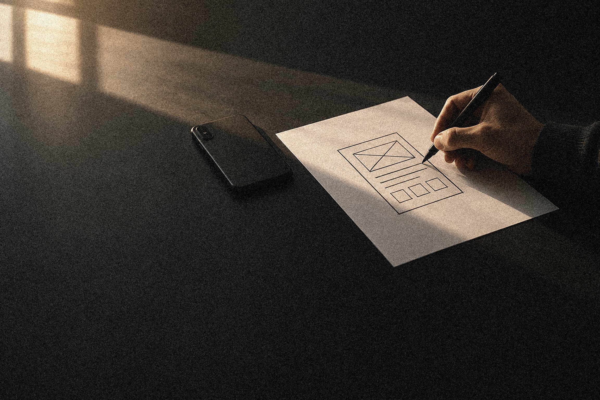
The scenarios add up to a sitemap: a list of pages and the links between them. Then each key page is laid out as a wireframe, a black-and-white diagram of blocks with no visual style. Wireframes are the cheapest place to argue about content, because a change takes minutes, not days.
What UI includes: the visual language and the system
Once the logic is agreed, work on the look begins. It's important not to confuse "design the homepage" with "design the interface."
Concept and style directions
We present several directions in different styles on the same key screen, usually the homepage or the most important landing page. That way the client compares character, not content: strict and technical, warm and human, bold and high-contrast. The chosen direction is then developed further.
UI kit
A UI kit is the set of all interface elements: buttons in every state (default, hover, pressed, disabled, loading), input fields with errors and hints, checkboxes, toggles, cards, modals, notifications. Without a UI kit, every new page is drawn from scratch, and six months later the site has six versions of the same button.
Design system
A design system is the next level: not just a set of elements, but rules. Grid and spacing, a type scale, color tokens, principles for using illustration and photography, rules for tables and forms. For a small site a tidy UI kit is enough, but for a service with a customer portal, or a company with several products, a design system pays for itself quickly: new pages are assembled from ready-made blocks, and developers reuse components.
Responsive layouts
Responsive layouts aren't "the same thing, only narrower." On a phone, the order of blocks changes, tables turn into cards, catalog filters move to a separate screen, and the request button sticks to the bottom.
The deliverables you should receive
A good way to vet a vendor is to ask exactly what will be handed over at the end. For a mid-sized website, a reasonable set looks like this:
- a short research report: audience, scenarios, competitor findings;
- a CJM and user flows for key scenarios;
- a sitemap and wireframes of the main pages;
- mockups of every unique page and template (product page, article, service page) in desktop and mobile versions;
- a UI kit or design system with element states;
- a description of interactions: what happens on hover, when the menu opens, when a form is submitted, on error;
- dev-ready files: a clear layer structure, components, and exportable graphics.
The scope of deliverables directly affects the budget, so it only makes sense to compare vendor proposals against the same list.
How to evaluate a design before development starts
The most expensive mistake is finding a design problem after the site is already built. Here's what you can check on the mockups.
- The five-second test. Show the main screen to someone who wasn't involved in the project and take it away after five seconds. They should be able to say what the company is, what it offers, and what they can do next. If they can't, the first screen is overloaded or talking about the wrong thing.
- Walking through the scenarios. Take a user flow and go through it on the mockups, screen by screen. Every transition should exist in the mockups, including errors and empty states: empty cart, no results found, form submitted.
- A clickable prototype. Build an interactive prototype from the mockups and have three to five people from the target audience go through it with a specific task. That's usually enough to find the most serious problems.
- Real content. Check that the mockups use real copy and photos, not "Lorem ipsum." A long product name or a three-line headline breaks a pretty card, and it's better to find out now.
- Mobile, separately. Open the mobile mockups on a phone at actual size. Check that buttons are easy to tap, text is readable without zooming, and nothing important has drifted to the very bottom.
- Alignment with development. Ask a developer to review the mockups before final sign-off. They'll quickly spot decisions that are expensive to build or that don't work well with the chosen CMS.
It's also worth checking how the design accounts for search: is there room for text blocks, a correct heading hierarchy, and is content not hidden away in tabs and sliders?
Custom website design or a template
A template looks like a sensible saving: buy a theme, swap the logo and colors, launch in a week. For a landing page for a one-off campaign or for testing an idea, that can genuinely work. For a company's main website, templates have systemic drawbacks.
- A structure built for someone else's problem. The template was designed for an abstract client. Your product has to be squeezed into ready-made blocks: three benefits with icons, a slider, testimonials. If you have a complex offer that needs explaining, the template won't explain it.
- Sameness. Popular themes run on hundreds of sites, including your competitors'. A visitor comparing three tabs won't remember which one was yours.
- Excess code. Themes are built to be universal, so they drag along scripts and styles for features you don't use. That hurts load speed.
- Expensive changes. The first non-standard task (a calculator, a customer account, a filter by unusual parameters) hits the limits of the theme, and it has to be rewritten.
Custom website design isn't about "unusual images." It's an interface designed around your customers, your product, and your sales channels. That's exactly why we design from scratch, without templates: it's the only way for a site to solve a specific business problem rather than the theme author's problem.
Custom design is an interface designed around your customers, your product, and your sales channels.
How to choose a web design agency
When you're ready to hire someone for website design services, look beyond how pretty the portfolio is. A few questions will help you tell an agency that designs from one that just draws:
- Where does the work start? If the answer is "send us references and we'll design the homepage," there won't be a UX phase.
- Will you show wireframes before visuals? A good vendor agrees on structure before colors.
- How many style directions will there be at the start, and what happens if none of them fits?
- Does the work include mobile layouts for all key pages and a UI kit?
- Who will build the front end? If design and development are done by different teams, how will the handoff work?
- How do you test the mockups with users?
If you already have an outdated website, the conversation with a vendor should start not with new mockups, but with what the current site does for the business and what must not be lost in the redesign.
FAQ
Can I order UI design only if the structure already exists?
Yes, if the structure is genuinely worked out: there are scenarios, a sitemap, and wireframes agreed with the business. Even so, we start with a short audit of those materials. Often the "ready structure" turns out to be a list of pages with no logic for how users move between them, and design would only lock in its mistakes.
How long does website design take?
It depends on the number of unique pages, the depth of research, and how fast approvals happen. A landing page and a site with a customer portal differ many times over. A realistic timeline can be given once the structure and the number of page templates are clear.
Does a small website need a design system?
A full design system for a ten-page site is overkill. A tidy UI kit with element states and a grid description is enough. A design system pays off when the site grows, a customer portal appears, or there are several products under one brand.
What's the difference between a wireframe and a mockup?
A wireframe shows which blocks are on the page and in what order, with no color, fonts, or graphics. A mockup is the final look of the page with all the visual decisions. The wireframe is approved first, because changing content in it is quick and cheap.