A familiar story: the client signs off on a beautiful homepage, the designer draws twenty more pages, the developers build them. At acceptance, it turns out the sales team expected a calculator on the service page, legal wants a separate block for documents, and the catalog isn't organized the way customers actually look for products. Half the work gets redone.
A website prototype exists so these conversations happen at the very start, when a change takes minutes. Let's look at what a prototype is, what levels of detail exist, how it relates to site structure and SEO, and how to review it properly.
What a website prototype is
A prototype is a blueprint of the future site that shows which pages it has, which blocks appear on each page, in what order, and how a user moves between them. It has no final colors, fonts or photos. But it does have all the content: headings, copy or its gist, buttons, forms, filters, tables.
A good analogy is an apartment floor plan. Before choosing tiles and wallpaper, the architect decides where the walls, doors and outlets go. Moving a wall on paper takes a minute; in a finished apartment it means a renovation. A website works the same way.
A prototype answers three questions:
- What: which information and features the page needs;
- Where: in what order and with what priority they're arranged;
- How: what happens on click, where a button leads, what the user sees after submitting a form.
Wireframe, prototype, mockup: what's the difference
These terms often get mixed up, and as a result the client and the agency expect different deliverables.
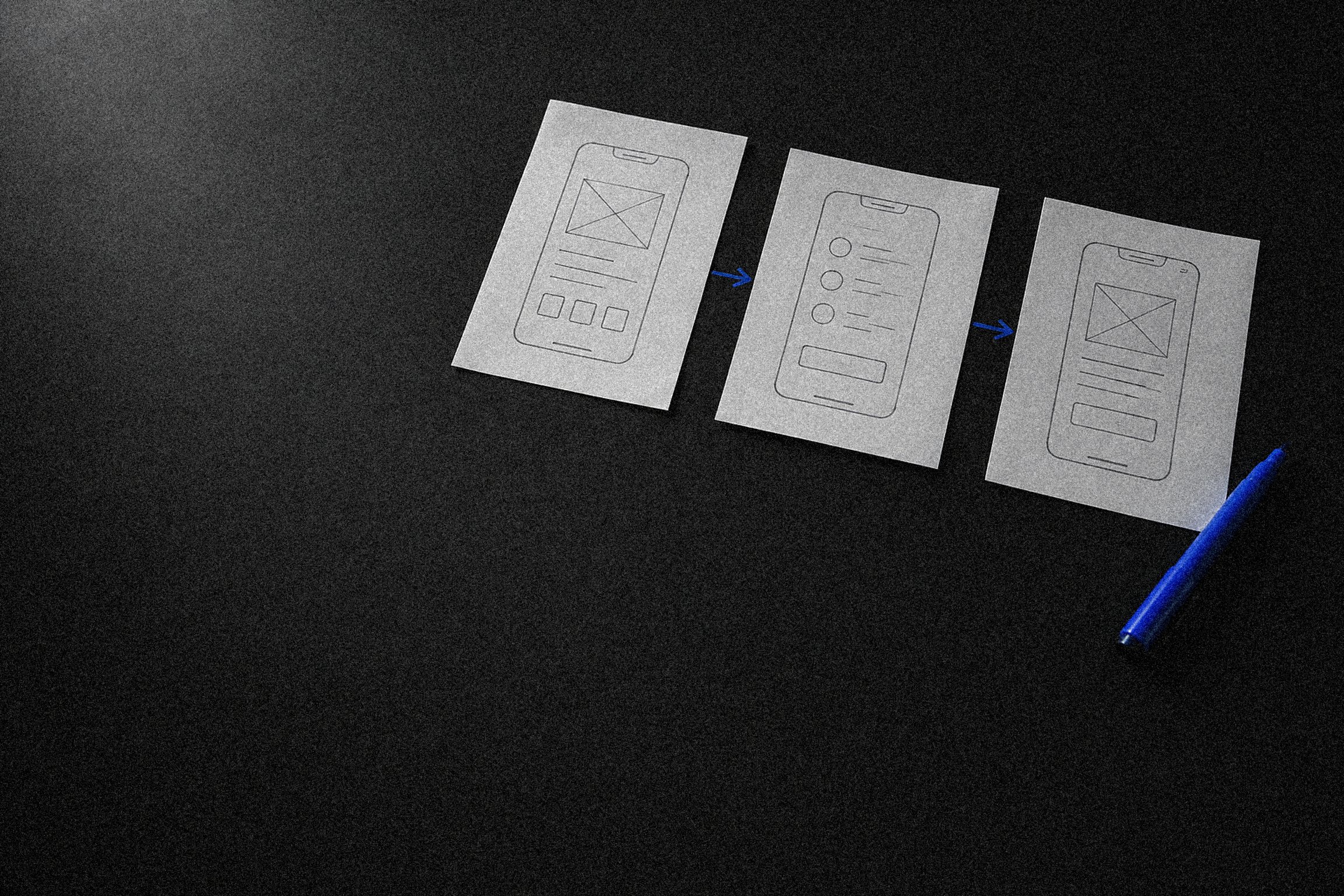
- A wireframe is a static page layout made of gray rectangles and labels. It shows which blocks there are and in what order. Quick to make, even quicker to change.
- A prototype is a set of wireframes linked by transitions. You can "walk through" it: click a menu item and land on the right page, open a product card, get to the form. Website prototyping is exactly this: building those links and testing user flows.
- A mockup is the final page design with color, typography, photos and icons. Mockups are made after the prototype is approved.
Low and high fidelity
Low-fidelity prototypes
Blocks are shown as labeled rectangles: "Headline with the main offer," "Three steps of how we work," "Lead form: name, phone, comment." Copy is placeholder or describes the intent. This kind of prototype is made when you need to agree on structure quickly: which pages are needed and what goes on them.
The upside is speed. In a single call you can rearrange blocks, drop an unnecessary page, add a section. The downside is that clients without experience may struggle to picture the result and approve it without reading closely.
High-fidelity prototypes
Here you have real or near-real copy, a precise grid and every interface state: an empty cart, a field error, loading, "no results found." Transitions are clickable, sometimes with simple animations. A prototype like this can be used for user testing and as a brief for developers.
High fidelity is justified for complex interfaces: user accounts, catalogs with filters, calculators, multi-step forms, web applications. For a corporate site of a dozen pages, low fidelity for all pages plus high fidelity for one or two key flows, such as submitting a request, is usually enough.
| Low fidelity | High fidelity | |
|---|---|---|
| Blocks | Labeled rectangles | Precise grid |
| Copy | Placeholder or intent-level | Real or near-real |
| States and transitions | None | All interface states, clickable transitions |
| Main advantage | Fast to change | Can be user-tested and handed to developers |
| When you need it | Agreeing on structure | Accounts, filtered catalogs, calculators, multi-step forms |
How to choose the level
The rule is simple: the costlier a flow mistake, the more detailed the prototype. An awkward form on a landing page costs a few lost inquiries, while an awkward checkout in an online store costs a noticeable share of revenue. In the second case, skimping on the prototype isn't an option.
The more expensive a mistake in a user flow, the more detailed the prototype should be.
Why you need a prototype: what it saves
A prototype doesn't add work. It moves the discussion to where it's cheaper.
- Designer time. Without a prototype, the designer draws final screens and learns about new requirements during review. Every iteration means redrawing a finished mockup with all its responsive versions.
- Development time. Changing the structure after the front end is built affects templates, the database and the CMS. These are the most expensive changes in a project.
- Stress during approvals. When the structure is approved separately, the design stage only covers visuals. "Let's add another section" after the prototype is signed off becomes a deliberate scope change, not a surprise.
- Copy and content. The prototype shows which copy, photos and documents each page needs. The copywriter and the client start preparing content in parallel with design, not a week before launch.
- Estimate accuracy. Developers can estimate a project far more accurately from a prototype than from a brief. Every filter, every integration and every form is visible.
Changing the structure after the front end is built affects templates, the database and the CMS. These are the most expensive changes in a project.
Prototypes and website structure
The prototype grows out of the site structure, not the other way around. At the research stage, the order of work looks like this:
- Goals and audience. Who comes to the site and what they should do: submit a request, buy, book, download a price list.
- User flows. The paths people take to reach that goal. They differ for new and returning customers, and for a procurement specialist versus an executive.
- Sitemap. The list of sections and pages, their hierarchy and connections. This is also where you decide which pages will be templates (product page, article, service) and which will be unique (homepage, about).
- Page prototypes. Each page is broken down into blocks based on the job it does in the user flow.
Prototypes and SEO
Site structure is also structure for search engines. That's why keyword research should be done before the prototype or alongside it, not after launch. Here's what to check in a prototype from a search perspective.
- Landing pages that match demand. If people search for a service with different wording and qualifiers, key query groups need their own pages. That decision is made at the sitemap level.
- Room for copy. Blocks for category descriptions, FAQs and specs are built into the prototype from the start. If they're not in the prototype, the designer won't draw them, and fitting copy into a finished design later is awkward.
- Heading hierarchy. The prototype shows where the H1 and subheadings are and whether they repeat across pages.
- Internal linking. Breadcrumbs, "related products" blocks, links from articles to services: these are all prototype elements, not late additions.
- URLs and hierarchy. The sitemap defines page addresses. Well-planned URLs now mean fewer redirects later.
How to review a prototype
A prototype is only as useful as the review it gets. A few rules that save weeks.
- Bring in everyone who will sign off on the site. If a sales director who wasn't there for the prototype shows up at final acceptance, their changes will arrive at the most expensive moment. Better to show them the blueprint now.
- Walk through user flows instead of flipping through screens. Instead of "take a look at the homepage," try "you're a customer who wants delivery tomorrow; show me how you'd do it." That's how missing steps get found.
- Check content, not looks. A prototype isn't the place to discuss button color or fonts. The questions are different: is there enough information to make a decision, is anything superfluous, is the next step clear?
- Record decisions in writing. A short list of changes with a decision on each: accepted, rejected, moved to the next phase.
- Show the prototype to a developer. They'll spot the tricky parts: a non-standard filter, an integration with an accounting system, features the chosen CMS doesn't support.
- Let an outsider try it. Two or three people from the target audience with a specific task are enough to reveal the worst navigation problems.
When you can skip the prototype
There are situations where a separate prototyping stage is overkill: a single-screen event page, a three-page brochure site with a standard structure, an urgent landing page to test an ad hypothesis. Even then, the designer usually sketches the structure quickly; it just doesn't go through a separate approval round.
For anything with a catalog, a user account, a complex form or more than one user flow, a prototype pays for itself. If you're updating a site that's already live, a prototype matters even more: it helps carry over everything valuable and avoid losing pages that bring in traffic.
As a web development agency, we create the structure and prototype in the first stage of every custom website development project. Examples of the challenges clients bring us are collected in Sphere's projects.
FAQ
Who makes a website prototype: a designer or an analyst?
It depends on the project. In smaller projects, a UX designer usually builds the prototype. In complex applications, an analyst prepares the user flows and requirements, and a designer turns them into screen layouts. What matters is that whoever builds the prototype has taken part in analyzing the business and the audience.
Can you make a prototype yourself and hand it to an agency?
Yes, and it's useful: your sketch shows what matters to you. But the agency should review it critically and check the user flows and SEO structure. A DIY prototype often mirrors the old site or a competitor's site rather than users' needs.
How is a prototype different from a technical spec?
A prototype shows how the interface looks and works. A technical spec also covers what isn't visible on screen: integrations, user roles, data processing rules, speed and security requirements. An approved prototype usually becomes an appendix to the spec.
How many prototype iterations are normal?
Usually two or three: the first version, revisions after discussion, final polish. If the iterations keep piling up, go back to the goals and user flows: most likely, the project stakeholders understand the site's purpose differently.